PURPOSE
Quick link to get started learing: Azure Log Query Education
Let me just get this out there, Azure Monitor Logs (formerly OMS, formerly Log Analytics) is quite possibly one of the most powerful log aggregation platforms out there. With so many ways and options to ingest data and with the powerful query language plus ability to integrate queries into monitoring alerts there really is almost nothing you can’t do with AML. In this post I’ll go over how to begin to use the InsightsMetrics table for Azure Virtual Machine performance modeling and viewing. As well as a general beginning to using Log Analytics.
Assumptions
- Virtual Machines are onboarded to Azure Monitor Virtual Machines (Preview)
- New to log queries
WALKTHROUGH
If you’re a seasoned KQL veteran, this post probably isn’t for you. If you’re new and just don’t know how or where to get started, this post is for you.
There are quite a few ways to get to the log workspace: from Monitor, from the VM blade, from All Resources, etc. I like to add Log Analytics as a favorite on my side bar (I’m in log analytics A LOT) for easy finding. Also, the new Azure Portal homepage has a really cool history Home page now that remembers your most used resource types.

Now that we’re in the workspace, it’s time to write your first query! Type this in the query box: InsightsMetrics and then click the RUN button

Congradulations! You’ve just run your first query. You’re also probably not very impressed with the results.

The first thing to understand about Log Analytics, it’s a data collector. It is constantly collecting data of all kinds and organizing this data into tables (called schema). After running the query above, you can see that what is returned is simply an ‘excel’ type worksheet full of all types of columns and rows filled with various ‘data’.
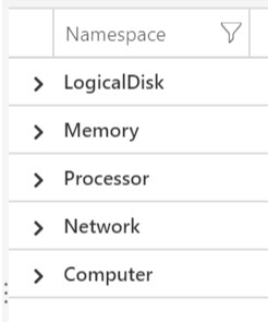
The hardest part of creating queries is understanding the data you’re working with. If I’m working with a new table or a table that I haven’t worked with for a while, I’ll usually filter the table to get an idea of what things we can start to look at. In our example of the InsightsMetric table, we’ll do this by adding a line to the first query like this:
    InsightsMetric
    | summarize by Namespace
The summarize option filters the table by the chosen column. In this case, we’re filtering on Namespace to understand all the different metric types we can visualize.

Now that we know what metrics we can query, let’s take a look at how to view Processor information.
    InsightsMetric
    | where Namespace == "Processor"
As you can see, while summarize and where both filter data, the output is much different. “Where” filters cell contents while “Summarize” filters the entire table. You’ll usually want to use summarize at the end of your query to only see the data you’re looking for as opposed to the whole table just filtered on the cell contents.
Now that we know the metric to query, let’s find out what counter types are available. These are found in the Name column.
    InsightsMetric
    | where Namespace == "Processor"
    | summarize by Name
For the metic category Processor we have counter value UtilizationPercentage. There is also one other column that we need to focus on, Val. This contains the metric values for the processor utilization at the time the data was sent to the log workspace. And now we’re getting somewhere.
The next step is to get rid of everything else that we don’t need. Not only does this help you read the table but it makes the query more efficient the less data it has to deal with.
    InsightsMetric //table to query
    | where Namespace == "Processor" and Name == "UtilizationPercentage" //only for Processor AND UtilizationPercentage
    | summarize by Computer, Val, TimeGenerated //filter on Computer, Val and TimeGenerated
A good practice to get into whether you’re coding or writing queries are comments. Comments help you remember what things are doing and why/how. To comment in KQL, simply add // before the line to comment.
This still isn’t exactly what we want so let’s continue. We have narrowed down the data we want, the next step is to actually do something with the data. We’ll start by creating an average on the processor utilization percentage. KQL has many mathematical features and the most widely used are avg() and arg_max(). In our situation we’ll focus on average. To get the average processor utilization percentage, the query looks like this:
    InsightsMetric
    | where Namespace == "Processor" and Name == "UtilizationPercentage"
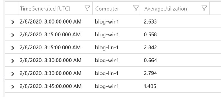
    | summarize AverageUtilization=avg(Val) by Computer, bin(TimeGenerated, 15m)
Now we’re getting somewhere, finally. So what’s going on here. Let me explain. Believe it or not, you can actually create columns on the fly. What we’ve done here is create a column named ‘AverageUtilization’ that contains the average values of the ‘Val’ column data. To ultimately get to the actualy pretty graph, you need to BIN the data into buckets of time. The bin(TimeGenerated, 15m) does exactly that. It takes the ‘AverageUtilization’ data and converts it into 15 minute bucket averages. You can see that in the output below:

In order to view time related data on a graph, you must bin your data into time buckets. Otherwise it doesn’t work. You can get pretty granular but the larger the time period you’re looking at, the larger the bin bucket needs to be because of query time, data points and overall graph visuals. The more data points, the busier the graph which make it much more difficult to read. Now, let’s create our first visualization.
    InsightsMetric
    | where Namespace == "Processor" and Name == "UtilizationPercentage"
    | summarize AverageUtilization=avg(Val) by Computer, bin(TimeGenerated, 15m)
    | render timechart
That’s pretty cool right?

CONCLUSION
Now that you’ve seen how I work my way into a Log query, hopefully this should help get you started writing your own queries. At the top of the post, there is a link to the Microsoft document page. This is also a great start and also how I began learning KQL. Also, here is a sample of what you can do with a log query (this one is on the older Perf table but still neat). Can you see what it’s doing? Now, take all these things and go off and experiment and try different things and see what happens. That’s the best part!
    Perf
    | where CounterName has '% free space' and Computer in ((Heartbeat | where OSType has 'windows' | distinct Computer))
    | where InstanceName !has '_total' and InstanceName !contains 'harddisk' and InstanceName !has 'C:'
    | project Computer, InstanceName, CounterValue
    | summarize PercentFree=avg(CounterValue) by Computer, InstanceName
    | project Computer, InstanceName, PercentFree
    | join (Perf
    | where CounterName has 'free megabytes' and Computer in ((Heartbeat | where OSType has 'windows' | distinct Computer))
    ) on InstanceName, Computer
    | where InstanceName !has '_total' and InstanceName !contains 'harddisk' and InstanceName !has 'C:'
    | project Computer, InstanceName, CounterValue, PercentFree
    | summarize averageMegabytesFree=avg(CounterValue) by Computer, InstanceName, PercentFree
    | project Computer, InstanceName, averageMegabytesFree, PercentFree
Photo by Danielle MacInnes on Unsplash